Using LIMS for Data Visualization

Credit: Brenda Carey, CSols, Inc.
Want to listen to this article for FREE?
Complete the form below to unlock access to ALL audio articles.
Read time: 5 minutes
Why is data visualization important?
The COVID-19 pandemic may have been the proverbial straw to break the old business paradigm, because the past year saw many organizations rethink their operating models. When people cannot gather in person to talk through ideas, the mode of communication becomes ever more important. Organizations that depended on office hours and face time are beginning to see the benefits in making data available in more than one form, to increase its utility for anyone who needs to use it. Laboratory-dependent organizations are no different. Data accumulates and must be used to make decisions, even when those decisions have to be made remotely.
Presenting the same information in a variety of ways increases the likelihood that it will be understood, and may help digitally transform your organization. The sheer volume of data that laboratories generate is a challenge to interpret but is often less intimidating in visual form. Data visualization improves business intelligence, identifies insights and uncovers hidden benefits in your laboratory informatics data. This same data can generate new product ideas, drive innovation, and lead to more efficient and effective outcomes. Appropriate data visualization can even help with the day-to-day running of your lab, for example, by replacing a whiteboard for staff assignments with a dashboard so that heritage data is not lost, and the reassignment of work can happen easily when bottlenecks develop.
Commercial data visualization tools have evolved as a combination of presentation software and business intelligence tools, but visual representations of data are much older than Crystal Reports or Power BI. Maps, charts and tables have been doing this work for hundreds of years. Today’s data visualization tools have the advantage of not requiring the user to be an artist or a statistician, which broadens their application.
How can laboratory informatics benefit from data visualization?
Originally, laboratory informatics solutions were seen as data collection and storage vehicles, designed for information management. Laboratory informatics were underused as sources for business insight, both in terms of their data and the formats in which the data could be displayed. Now, that is changing. Organizations served by laboratories are beginning to see the value of collecting their data in central repositories like an enterprise content management system, for the express purpose of data visualization and analysis.
Transforming lab informatics data into complex visualizations, which may combine data from several reports, provides the opportunity to see previously unrecognized patterns. For example, you may notice that material from a particular supplier is out of spec once every three months, or that one of your labs consumes reagents at a much greater rate than the others. In those cases, it’s worth exploring to find the root cause. Another interesting application is the use of 3D visualizations for liquid chromatography–mass spectrometry (LCMS) data. This approach gives users another way to look at excipients or unknown peaks.
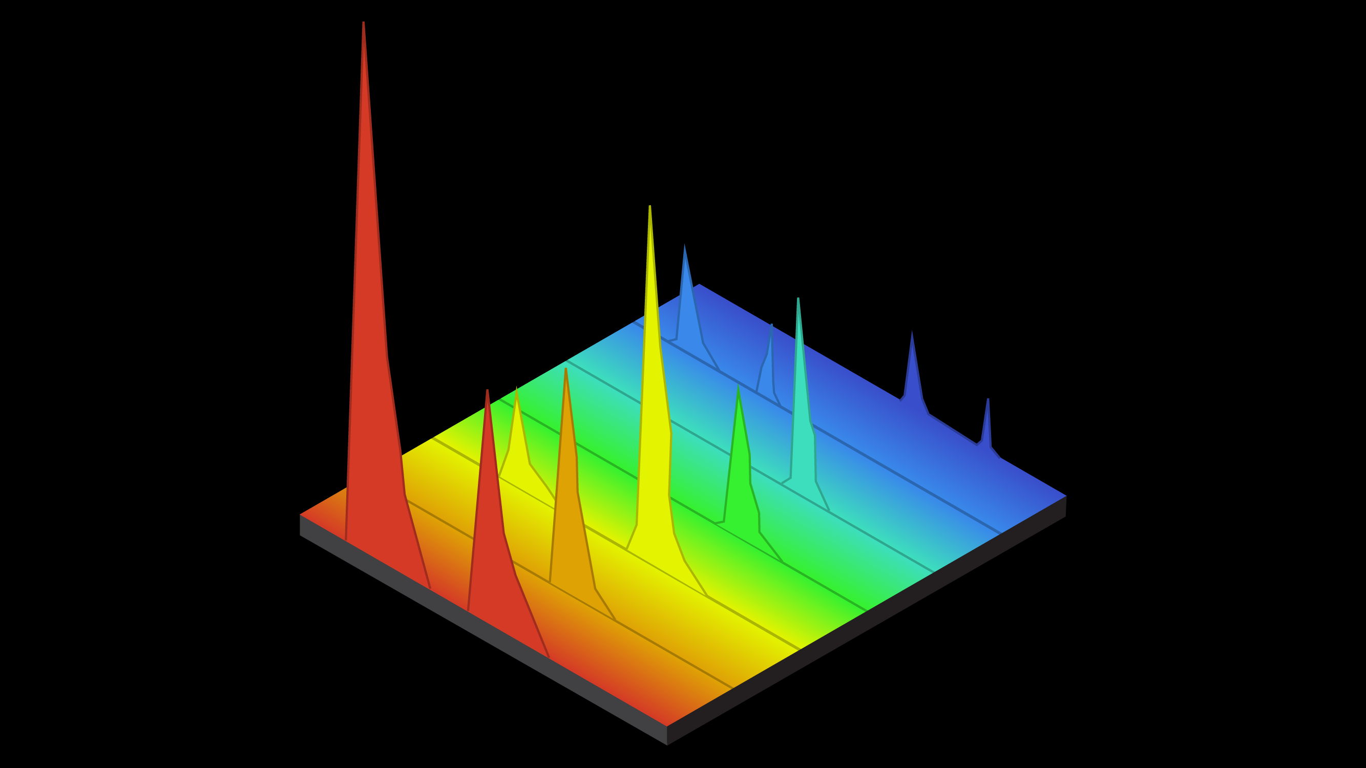
A 3D chromatogram.
What data visualization tools are available on LIMS platforms?
Each of the major LIMS products has provided at least some data visualization capabilities with their more recent versions. LIMS vendors that include a data visualization module have primarily chosen to base the capability on commercial data visualization tools that are very user friendly, such as Tableau, TIBCO Spotfire or Northwest Analytics. Not all LIMS have an integrated data visualization tool, and in those cases, one of the commercially available options will need to be configured to work with data from the LIMS. This kind of configuration is highly personal and depends on the kinds of data in the LIMS.
Much of the increased emphasis on data visualization is being driven by the lab analysts themselves, because recent grads are coming out of college or grad school with advanced visual analytics skills. Some of the tools your lab analysts may already be familiar with include R, ggplot2 and Python, which are powerful programming languages that many scientists are using in their research. Many additional tools have been built on these languages that make it easy to create dashboards and high-quality visuals from raw data. Examples of these include Jupyter or Bokeh, which are web-based solutions that work with various programming languages to produce dashboards or complex visualizations. When new analysts are accustomed to such robust visualization tools, they may not be content to settle for less.
What LIMS are best for data visualization?
It is fair to say that the best LIMS for data visualization is the one your organization chose as best for its needs. All industries and businesses have unique needs that their LIMS is configured to support. All LIMS are capable of having their stored data extracted and visualized, and most LIMS are compatible with a range of visualization tools. LIMS users usually have options for what form the visualized data can take. Therefore, the choice of LIMS should not be made on the basis of how fancy your data outputs will look, but rather by how well it serves the needs of your organization.
You can read more about the data visualization options from well-known LIMS vendors at their websites:
Unfortunately, providing the tools doesn’t automatically produce good visualizations. If you invest in data visualization tools for your laboratory informatics solution, it’s worth looking into any of the numerous free training classes available online, to be sure your end users make the most effective data visualizations they can. It’s also important to understand that data visualizations are subject to interpretation and not free of bias, so some training in the appropriate use of visualization techniques is a wise investment.
How can AI help with data visualization?
Artificial intelligence (AI) in the laboratory is primarily used to make sense of big data, the almost impossibly large sets of data that biologists and pharmaceutical R&D teams are accustomed to working with. AI algorithms can parse large amounts of data in a short amount of time and turn that data into visualizations that viewers can easily understand.
In certain data-intensive fields, such as genomic testing and virus research, AI algorithms are the best way to sort through the data and do some of the pattern recognition work. For instance, a breakthrough in DNA research occurred recently where the AI tool AlphaFold was used to successfully predict how proteins fold up into their 3D forms. This research will hopefully lead to many advances in treating or curing genetic diseases. Another particularly relevant application is in vaccine development, where AI has recently been used for COVID-19 and malaria vaccines. Big data and AI algorithms are working their way into agriculture and food safety, too. Expect big data and AI to continue to expand in importance, as the generation of unstructured, raw data increases.
Predictive analytics
The ability to visualize large quantities of targeted laboratory data from a LIMS can help identify trends and issues that would normally be very difficult to identify in spreadsheets, lists, reports or queries. In addition, leveraging data visualization to connect multiple sources of data (i.e., LIMS, ERP, MES) allows for cause-and-effect interpretation across manufacturing, supply chain, environmental, research and development and quality. These concepts are collectively known as predictive analytics. Predictive analytics is finding wide application in the fields of health care , drug discovery, agriculture and business analytics in general, among others.
Build in data visualization capabilities for the future
An important part of choosing a laboratory informatics solution is to thoroughly define user requirements. If you are in the process of selecting or upgrading your laboratory informatics solution, it makes sense to keep in mind the potential utility of data visualization. Integrating a data visualization tool during a new implementation or an upgrade provides the opportunity to configure reports and master data to best support the visualization tool. In this way, you can more easily derive the full business value from your laboratory informatics solution and its data.
Becky Stewart is a Scientific Copywriter at CSols, Inc.